Post 2: Sifting Through the Ingredients – Exploring Earthquake Data in Washington State

Introduction
In the kitchen, before you start cooking, it’s essential to examine your ingredients, get a feel for their flavors, and figure out how they’ll work together. In the world of data science, this process is called Exploratory Data Analysis (EDA). Think of it as tasting and adjusting your ingredients to ensure the final dish is just right. Now that we’ve prepped our data, it’s time to take a closer look at it, one ingredient at a time, and uncover the unique “flavors” of Washington’s earthquake data.
1. Univariate Analysis: Tasting Each Ingredient Individually
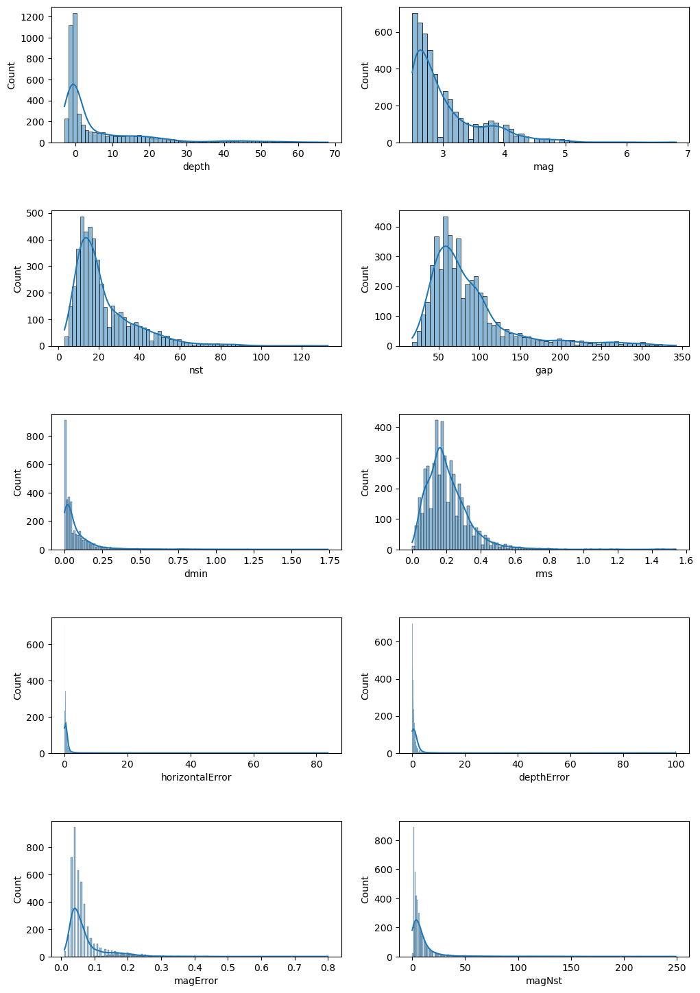
Our first step is to understand each variable in the dataset independently. This process is like tasting individual ingredients to get a sense of their flavors. Here’s what we discovered:
- Magnitude: We looked at the distribution of earthquake magnitudes. Most quakes are on the smaller side, with only a handful reaching those intense, table-shaking levels. It’s like a recipe with a dash of spice here and there—intense but infrequent.
- Depth: Another important factor is how deep the earthquakes are. Most quakes in Washington occur at shallow depths, meaning they’re more likely to be felt on the surface. This is like adding a top layer of seasoning that’s immediately noticeable!
- Location (Latitude & Longitude): Each quake has a specific location. By plotting these, we can see clusters of activity around certain areas—these are our “hot zones,” like ingredients that bring a strong, dominant flavor to the dish.
Through univariate analysis, we’re starting to identify what makes each ingredient tick, setting us up for the next step: understanding how they interact.
2. Multivariate Analysis: Combining Flavors
Now that we’ve tasted each ingredient individually, it’s time to mix them and see how they play together. In data terms, this means exploring the relationships between variables. Let’s add a pinch of depth, a sprinkle of magnitude, and see what flavors emerge!
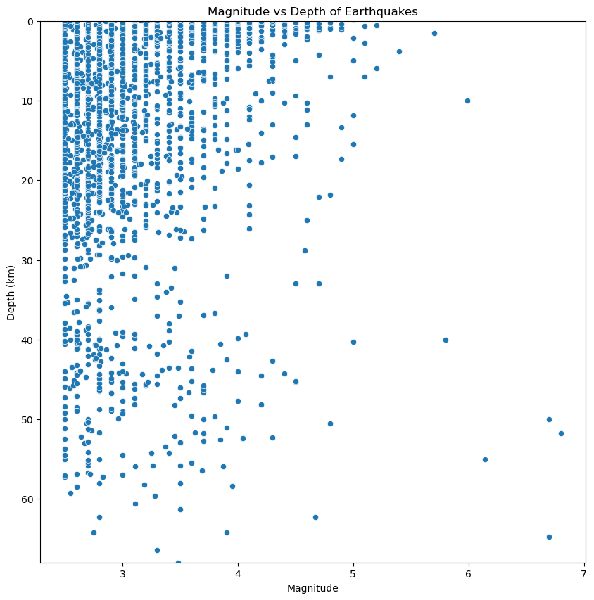
- Magnitude vs. Depth: We found an interesting pattern here—larger earthquakes tend to happen deeper underground, while smaller ones are shallow. Imagine the depth as layers in a cake, with the biggest quakes baking deep in the center, while the smaller ones are more like the frosting on top.
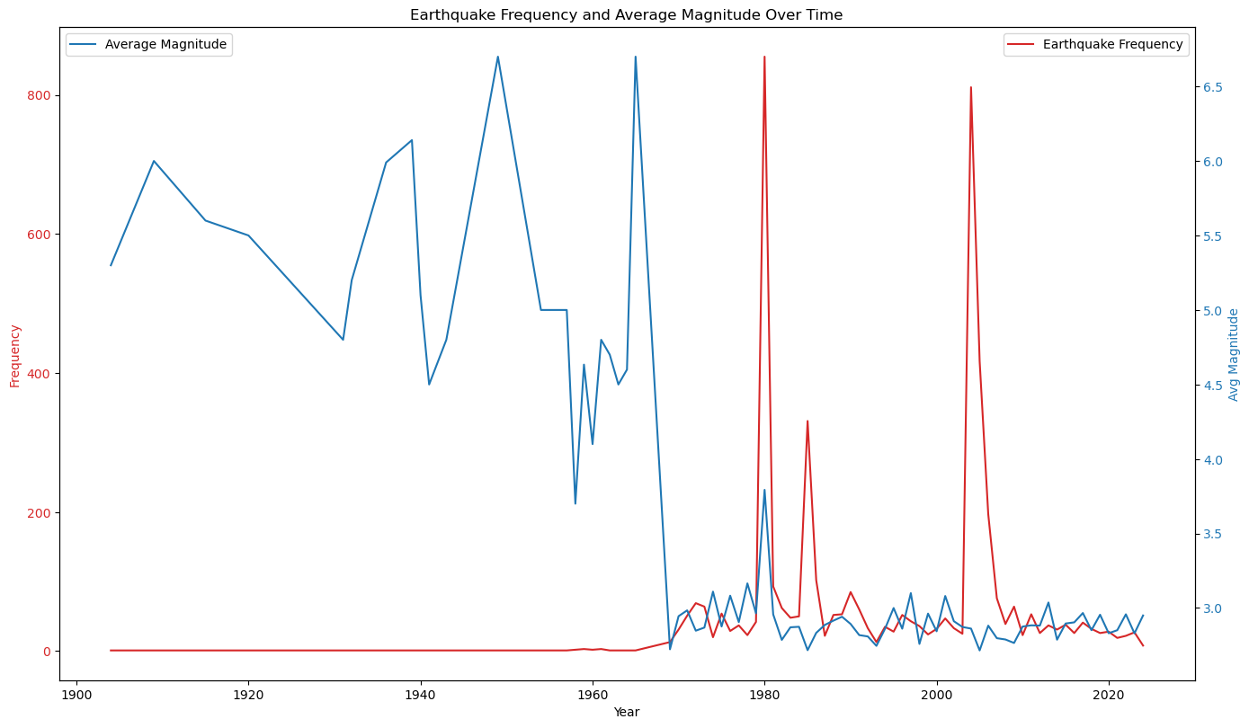
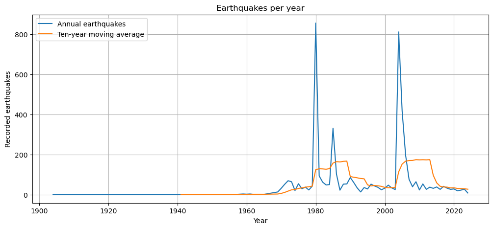
- Frequency Over Time: By looking at the dates, we tracked how often earthquakes happen in Washington. It’s like flipping through a cookbook that reveals a trend: more recent years have seen more quakes. Maybe we’re dealing with a spicy recipe that gets hotter over time!
- Cities with High Earthquake Frequency: Some cities showed up again and again in the dataset. These are the “high spice” areas, where seismic activity is frequent and intense. For example, Seattle and its surrounding areas appear frequently—like the garlic of our recipe, always making its presence known.
3. Temporal Analysis: Timing the Ingredients
Timing is everything in both cooking and earthquakes. For this dish, we explored when earthquakes happen—do they strike more in certain years, months, or even times of day?
- Yearly Trends: Earthquake frequency varies by year. We saw that some years had a lot of quakes, while others were quieter. This is like a recipe where the flavors shift with the seasons, sometimes mild, sometimes intense.
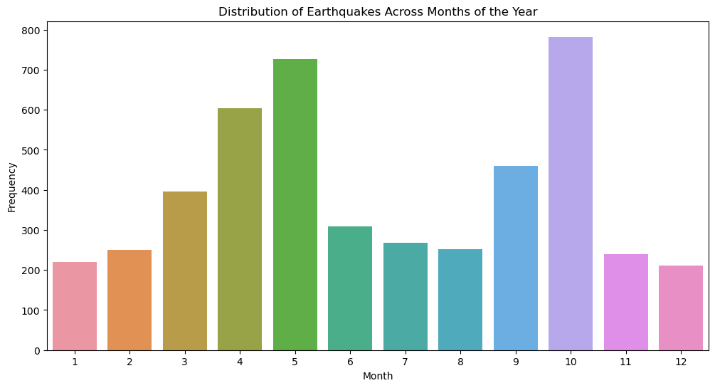
- Monthly Patterns: Surprisingly, we did find a strong pattern for certain times of months, suggesting that Washington’s earthquakes are mildly predictable since there seems to be an uptick in frequecies during May and October.
4. Spatial Analysis: Mapping the Ingredients
Finally, we took all of this data and mapped it out to visualize where the earthquakes are happening. This is where things get really interesting, as it lets us see our “flavors” on the plate:
- Clusters of Activity: By plotting earthquake locations on a map of Washington, we saw clusters of seismic activity. Certain areas—like Seattle—are more prone to quakes. Think of this like placing garnishes on a plate to highlight specific flavors.
- Overlaying Fault Lines: To add even more depth, we layered the earthquake data over Washington’s fault lines. This is where our dish comes together, showing that areas near fault lines experience more quakes, much like spices tend to concentrate in certain bites.
Conclusion
Through this exploratory analysis, we’ve tasted, mixed, and visualized our ingredients, gaining a better understanding of what makes Washington’s earthquakes unique. Now, we’re ready to move on to the next phase, where we’ll dig deeper into the statistical methods that help us quantify these patterns. In the next post, we’ll add a few dashes of statistical analysis to refine our “recipe” and reveal new insights about Washington’s seismic activity!