Post 5: Plating the Masterpiece – Visualizing Washington’s Earthquake Risk

Introduction
Now that we’ve prepped, cooked, and spiced up our earthquake data, it’s time to plate the final dish. Just like a beautifully presented meal, data visualizations bring together all the flavors we’ve worked on and make the results easy to digest. In this post, we’ll serve up maps and charts that illustrate the patterns, risks, and future possibilities of seismic activity in Washington State. Let’s take a look at the finished product and see what our data-driven “meal” reveals!
1. Mapping Earthquake Locations: The Foundation of the Plate
Our first visualization is a map of earthquake locations across Washington State. This map serves as the base layer, much like a bed of rice or pasta on a plate. It gives readers a broad view of where seismic activity occurs, setting the stage for deeper analysis.
- The Cluster Effect Earthquake locations are plotted as circles, with different sizes representing various magnitude ranges. Clusters emerge in areas like Seattle and along known fault lines, revealing hotspots of activity.
2. Overlaying Fault Lines: Adding Depth to the Dish
Next, we layered known fault lines on top of the earthquake map. Think of this as adding sauce on top of the base layer, giving more depth and context to the visual dish.
- The Fault Line Connection By overlaying fault lines, we see a clear relationship between geological features and earthquake locations. This is like adding the final seasoning that ties the dish together, showing how the “heat” of seismic activity aligns with structural weaknesses in the Earth’s crust.
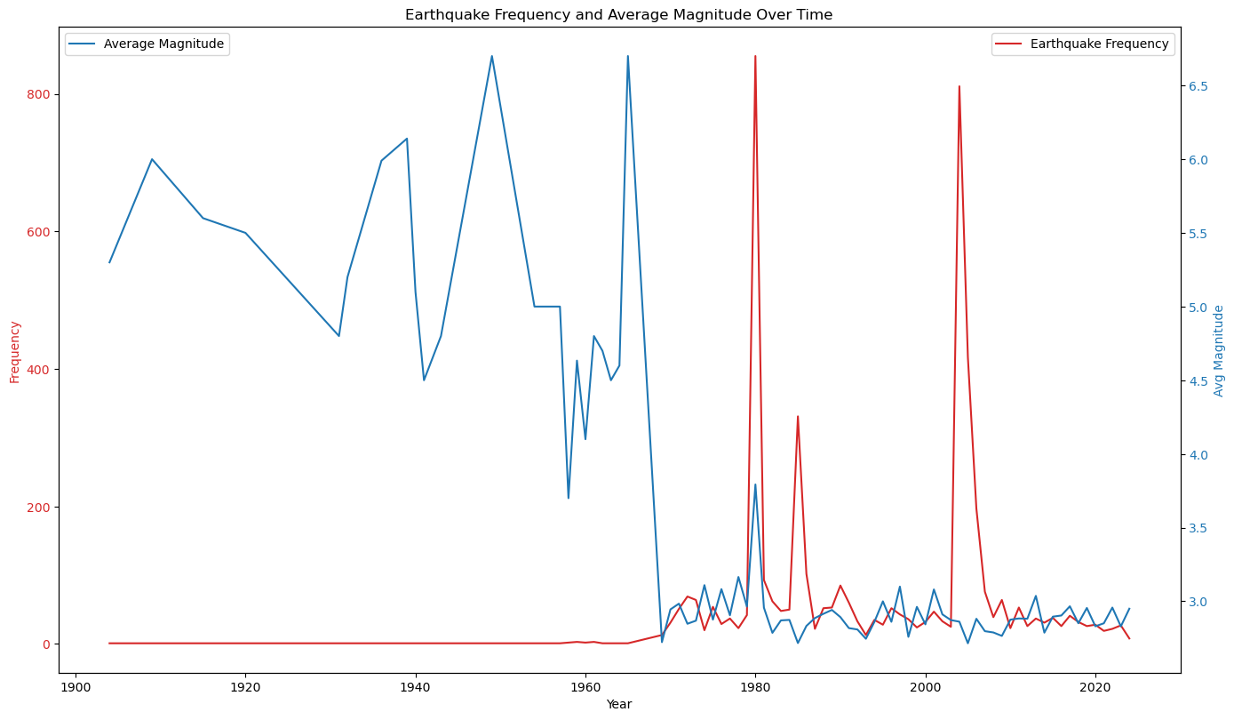
3. Magnitude Over Time: The Spice Levels
We also created a chart showing the magnitudes of earthquakes over time. Imagine this as a timeline of spice levels, where we can see which years brought mild quakes and which ones turned up the heat.
- Intensity Trends The chart reveals periods of higher seismic activity and highlights significant quakes over the last century. This helps us understand if there are periods when Washington experienced more intense shaking.

4. Probability Maps: Forecasting Future Flavors
Using our machine learning models, we generated probability maps that estimate the likelihood of future earthquakes in different regions. These maps are like predicting which bites of the dish will be spiciest—where should Washington residents expect the most activity?
- Risk Zones The map indicate areas with the highest risk of future quakes, based on patterns from the past century. This visualization serves as a powerful tool for preparedness, helping people understand where the likelihood of future quakes is greatest.
5. Combined Visualizations: The Grand Finale
Finally, we combined all these layers into a single, interactive visualization that allows readers to explore Washington’s seismic landscape. This is the plated dish, a complete meal that lets you savor each component in harmony.
- Interactive Maps Using tools like Folium, we created an interactive map that lets users toggle layers to view earthquakes, fault lines, and predicted risk areas. It’s a bit like presenting a dish in courses, where each bite reveals new flavors and textures.
Conclusion
With our analysis visualized, we’ve brought together all the flavors of this project to create a complete and satisfying “meal.” Through data cleaning, statistical analysis, machine learning, and visualization, we’ve created a thorough understanding of Washington’s earthquake risks. The insights from this project can help inform preparedness efforts and encourage residents to be mindful of the state’s seismic landscape.
Thank you for joining me on this culinary adventure through Washington’s earthquake data! Stay tuned for more data science recipes, where we’ll continue to transform raw data into tasty insights, one project at a time.